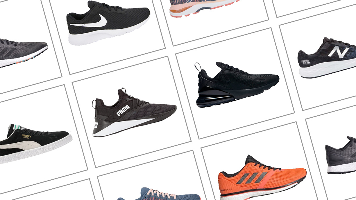
Preparing product images for an eCommerce store is important business. It can help make or break a web design. Do it well with these helpful tips.
Note: we would strongly recommend you hire a good professional photographer for product images but if you can't here's some helpful tips.
Include all of the product edges
All too often we see product images that are clipped or cropped unnecessarily. When taking the photo, stand back and include all of the product edges. The designer can zoom in and crop later but they can't realistically paint the product back in for you. If they do, it could be costly. Also make sure you centre the product correctly to aid the designer later if they do need to crop.
Product image backgrounds
You might have a fantastic product background in mind and it might be important to project a sense of lifestyle but the product you are selling is firstly the product. Ensure that it is clearly shown for your users. Omit busy background distractions and where possible create a strong contrast between the common background colour and that of the foreground. If a product image is repeated in Google shopping or Amazon, the background will usually become irrelevant at small scale.
Retain proportion on your product images
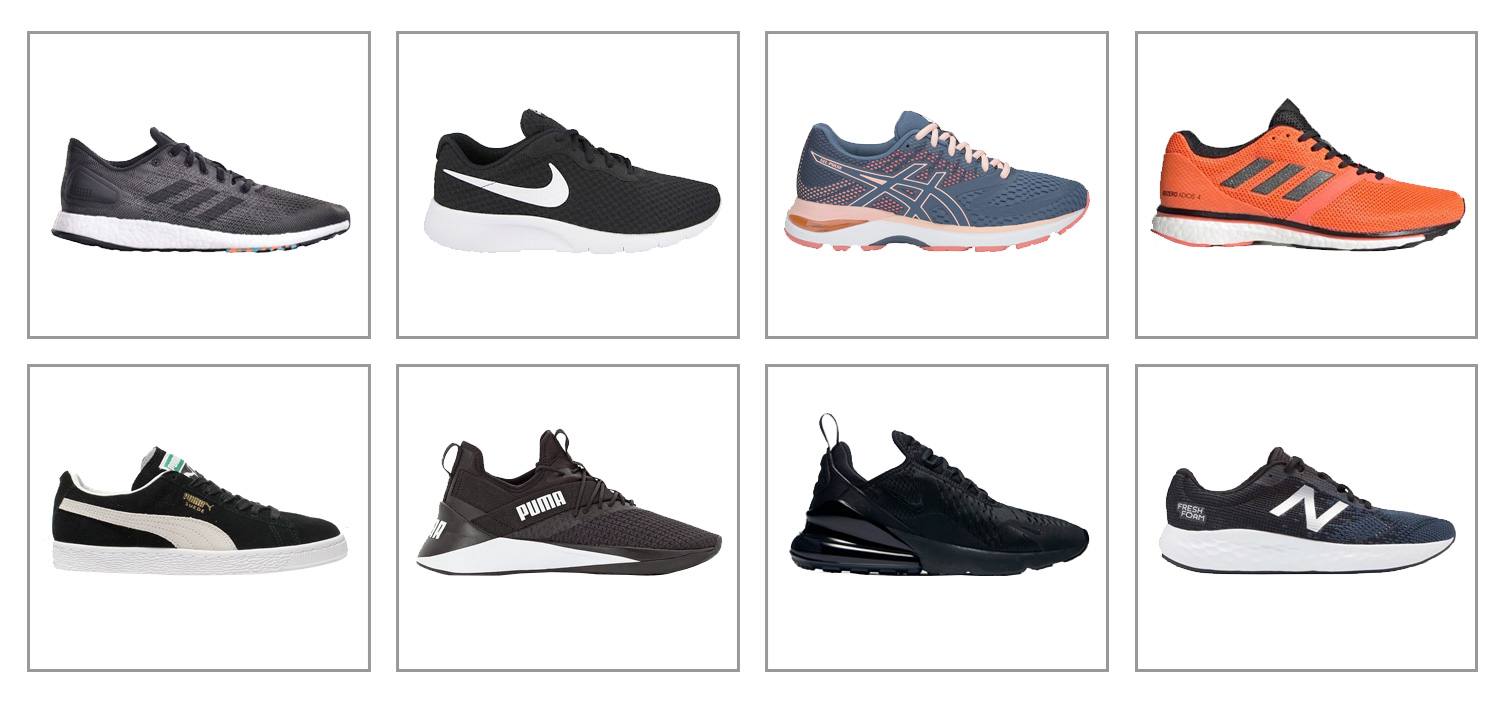
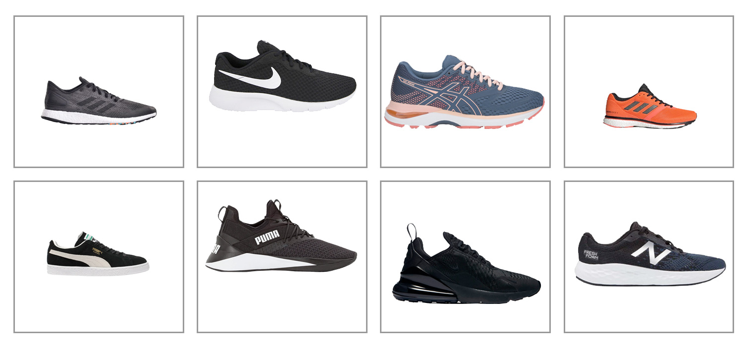
It's a common mistake to ignore this. Try to ensure the same proportions every time for your products. Instruct your photographer or designer to do this if you can't. Products presented on a category page need uniformity and harmony otherwise the page will look disjointed and unprofessional.
The Good

The Bad

Product Angles
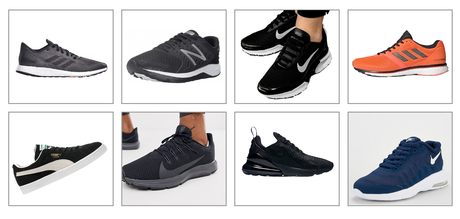
This is a questionable topic because some degree of variation might be nice for your design. However, you can vary with secondary images. Our recommendation to clients is to keep a uniform angle across the same product ranges on a category page. In a similar way to proportion, this will lend itself to the harmony of the overall category pages. Varying angles may divert user attention to a specific product. This is not always a bad thing but it can be done easily by rearranging the display order of the products later.
Here's an example of how similar products to the ones shown above might look together with different angles. Do you view all products as equal? We'll let you be the judge.

Go big on resolution
Screen resolution is growing fast and so is the need for product images to be bigger. Play it safe by taking large resolution images. You can always scale down for mobile devices but you can't scale up from the original.
- HD - 1920 pixels x 1080 pixels
- UHD - 3,840 pixels x 2,160 pixels
- 4K - 4,096 pixels
- 8K - 7,680 x 4,320


